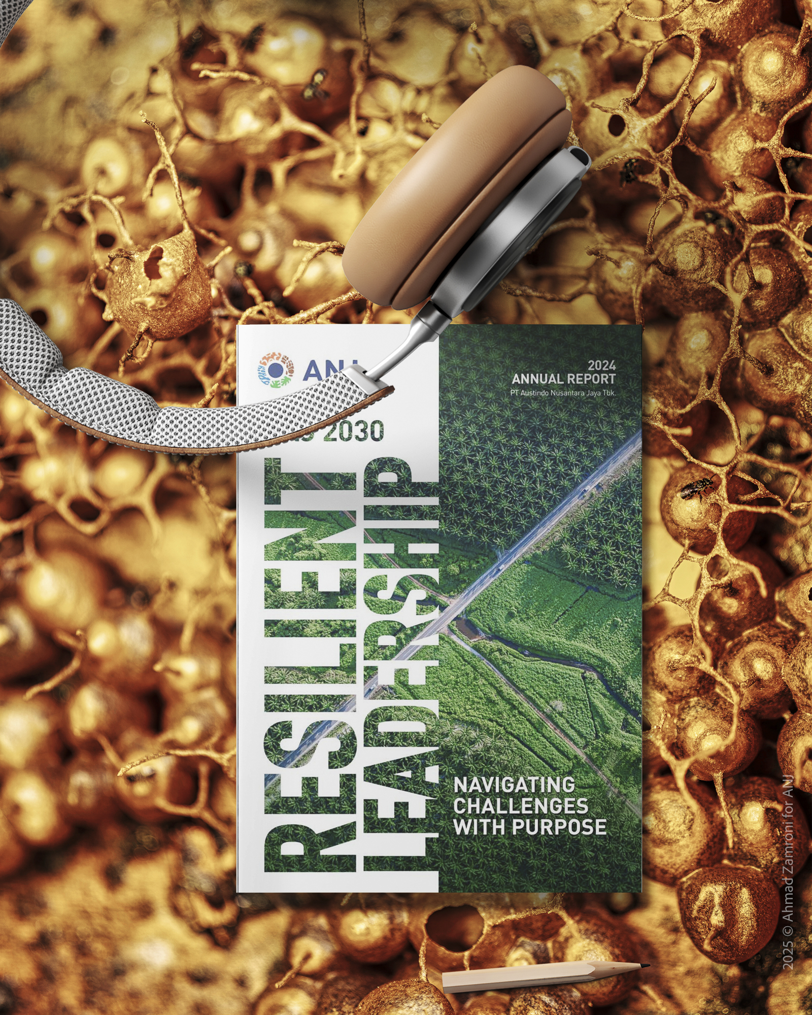
ANJ’s 2025 Annual Report Project
This year’s sustainability report was a rewarding experience, as I took on a role beyond my usual photography duties to contribute to its visual concept design. I am grateful to have collaborated with PT Austindon Nusatara Jaya Tbk on this annual report project for 2025, and I am honored to be part of such an outstanding team in this endeavor.
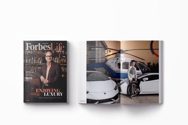
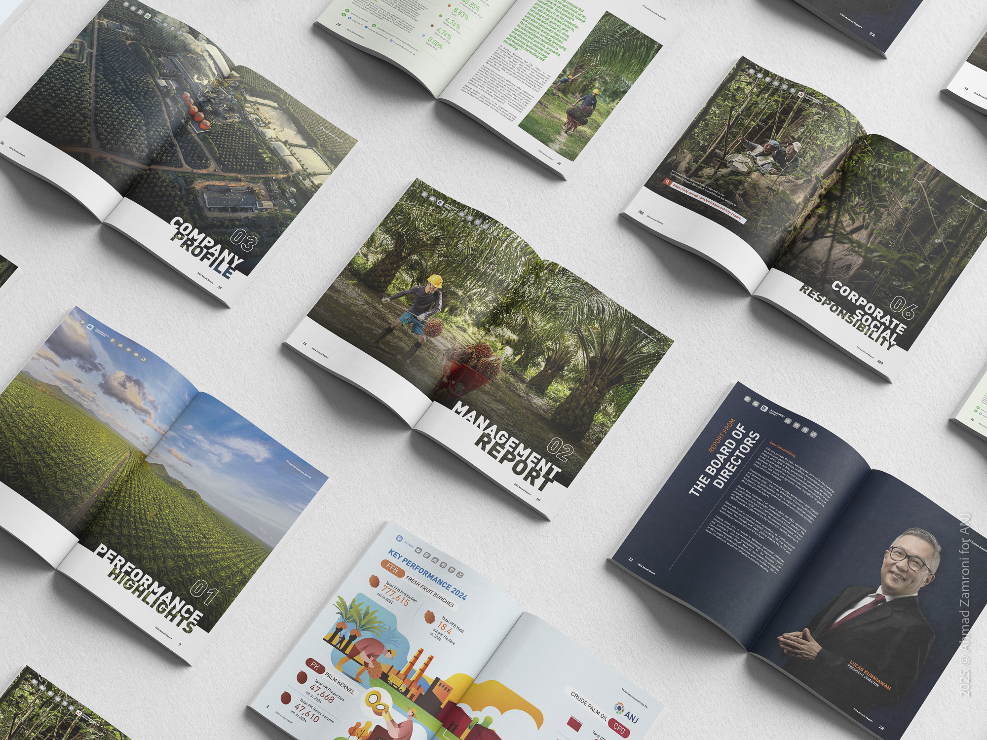
Annual Reports: Turning Data into Meaningful Stories
In today’s digital and visual-first world, an annual report is no longer just a corporate obligation filled with charts and financial figures. It has evolved into a powerful storytelling platform—a space where business strategy meets human narrative, and where raw data is brought to life through compelling design.
An annual report acts as the soul mirror of a company, reflecting not only what has been achieved, but also why and howthose milestones were reached. For stakeholders—investors, partners, communities—it forms the foundation of trust. Yet in a noisy information landscape, a dull and rigid report can quickly be forgotten. This is where narrative design and visual storytelling become essential.
“I see graphic design as the organization of information that is semantically correct, syntactically consistent and pragmatically understandable.”-Massimo Vignelli (1931–2014) was an influential Italian designer

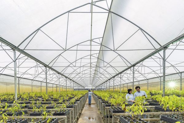
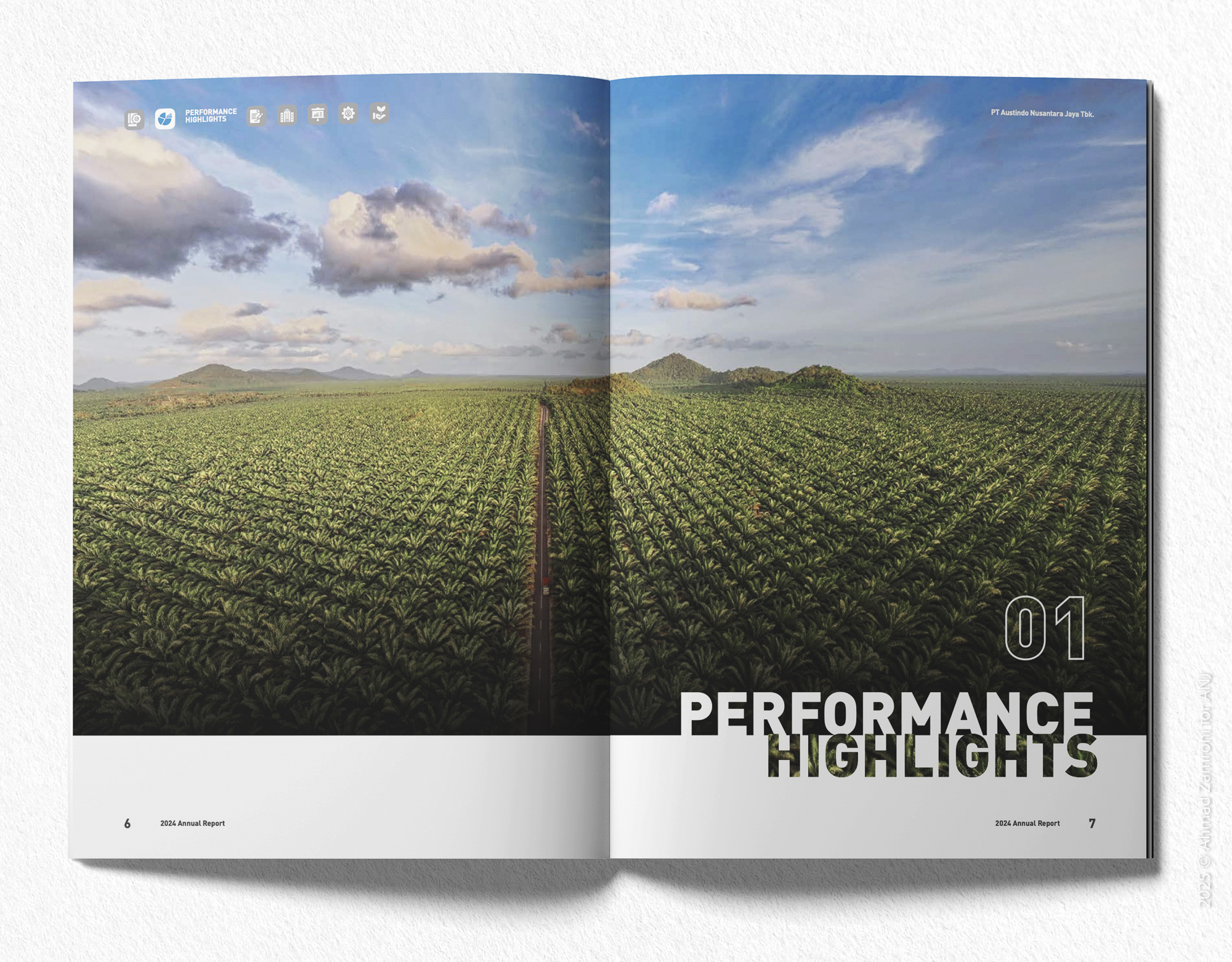
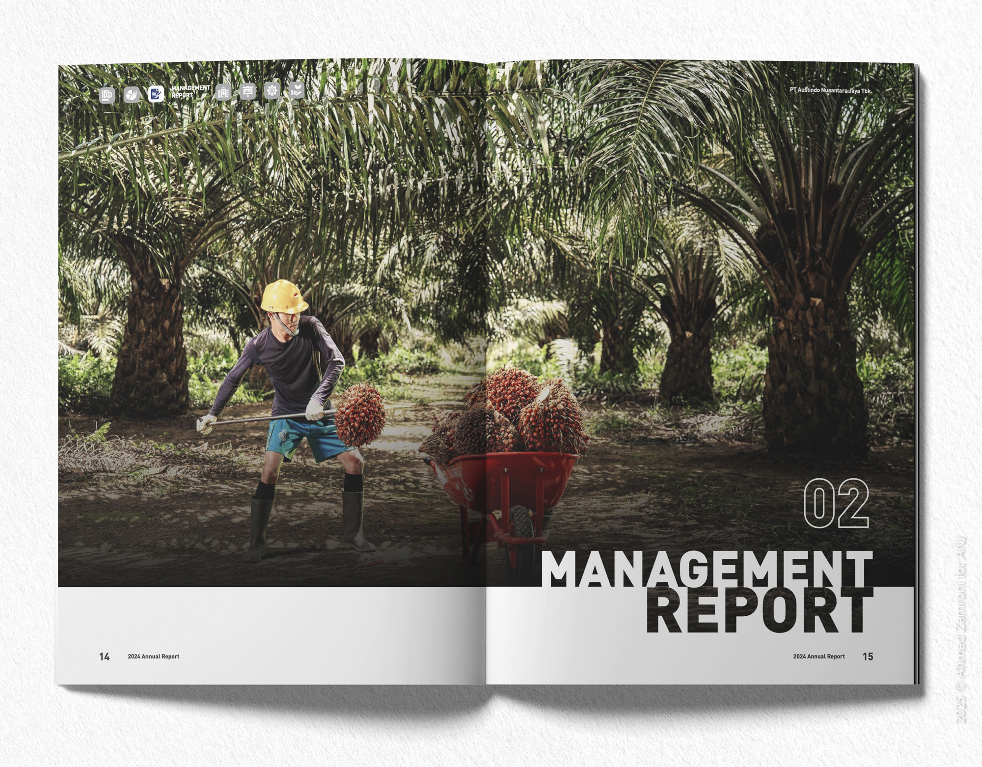
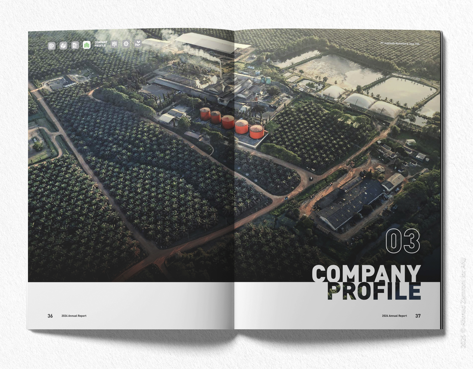
Beyond aesthetics, good design guides readers through a well-structured journey. Interactive infographics, documentary-style photography, and meaningful illustrations become tools for emotional connection. A well-crafted report doesn’t just inform—it invites readers to experience the company’s journey.
Imagine opening a report with portraits of lives impacted, then transitioning into sustainability data visualized in immersive and human-centered ways. It feels less like reading a business document, and more like diving into a visual mission statement.
More than a report, it becomes a company’s manifesto—a declaration of accountability, impact, and direction. And when stories are told with authenticity, a well-designed visual can speak louder than a thousand words.
“Design is not just what it looks like and feels like. Design is how it works.”-Steve Jobs